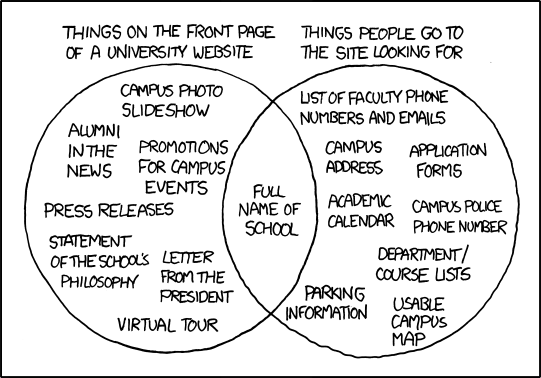
I’ve been reading up a lot lately on web usability, which is the art and science of making web sites user-friendly. Most of the literature deals with presentation (fonts, colors, layout, etc.) and programming elements (pop-up info boxes, dialog boxes, etc.). This diagram (hat tip to Jeffrey Zeldman) deals with actual content:
Of course, this example illustrates a university website, but it could easily be adapted to the sites of government agencies, non-profits, and even many businesses and corporations of all sizes.
When I showed this to RoZ, she had an immediate reaction to its humor and astute accuracy, even though I introduced it as “kinda geeky.” She made remarks about “publicity vs. useful information.”
It vividly illustrates a disconnect in modern communication where our major institutions have fallen completely out-of-touch with the people they serve.


