The Wayback Machine – A How-to

One of our discussion participants recently lamented that when a certain web domain went dark, he lost years worth of blog posts that were hosted on that site. My first thought was to check the Wayback Machine, an online archive of content from the past. With the Wayback Machine, you can see the content and styling of a site as it was at the time it was archived by the Wayback system.

Using the Wayback Machine, I was able to point this guy to four pages of complete posts with images and everything… easily 10,000 words of writing he had thought were lost forever. If you want to check the Internet of the past, the simple instructions are after the jump. Read on

purplearth_s – Our New Theme

Our previous theme (The “theme” determines the “look” of a WordPress site such as this one) was beginning to get a bit stale. So I built a new one.

Over the past few years, I’ve tweaked, fixed, and slapped together themes for dozens of WordPress sites. With a bit of extra time over the past week or two, I endeavored to build a purplearth theme that presents our content aesthetically and usably while introducing features that define a modern web site.

I also wanted to make a theme that didn’t look like a WordPress theme.

After the jump, I’ll talk about the highlights of this new theme, and the thought process that went into it.

Read on

A Bite Out of the Sun

It’s rare enough to see a partial solar eclipse, but to have it happening during sunset is a photo-opportunity that can’t be passed up…

A partially eclipsed sun peeks below the cloud layer before setting over the Mississippi River in La Crosse, Wisconsin on May 20, 2012

It was cloudy all day today. I made a special trip to Riverside Park in La Crosse not knowing whether I’d ever see the setting sun. It appeared from behind the cloud bank just as I arrived, then sank below the horizon five minutes later, but not before I managed to capture this image.

A Month of Storms in 100 Seconds

RoZ and I are both weather geeks, and I’m a sucker for time-lapse video. I also think the brief animation of weather photos (satellite images, radar, etc.) that we see on TV or the Internet are kind of lame.

Knowing that the satellite picture is regenerated every half hour (and that the weather was about to get interesting), I set up our computer to automatically grab the image every half hour. I let the automatic frame grabber run until the weather got boring again, and assembled the 1300+ images into the video presented below.

You’ll see the progress of hurricane/tropical storm Irene, Lee, Katia, Nate, Maria and Ophelia. In between, there’s a persistent low pressure system that whirls over the midwest.

httpv://www.youtube.com/watch?v=RY-HRfTEQ5c

Steve Jobs – A Pioneer in User-Friendly Design

iSadThe news of Steve Jobs’ passing was delivered to me on the screen of my Apple computer. It’s kind of fitting, given the many ways that he has affected our day-to-day lives whether we use his products or not.

My first exposure to Steve Jobs was on an episode of Nightline in the late ’70s or early ’80s. He was a talking head guest discussing the advent of the personal computer. The line that sticks in my head to this day (paraphrasing from memory): “Just as a tool is an extension of our hands, the computer is an extension of our brains.”

(Here’s a youtube video of a young Steve describing computers as “bicycles for our minds.”)

He went on to discuss how these tools – once exclusively owned and operated by rich corporations and governments – were now accessible to ordinary people, and that this would cause the innovation and transformation that we’ve all witnessed since then.

Steve didn’t invent computers, portable music players or smartphones. What he did was to refine these products down to the most minute detail to make them not only easy to use, but a joy to use. Read on

That’s the Spirit

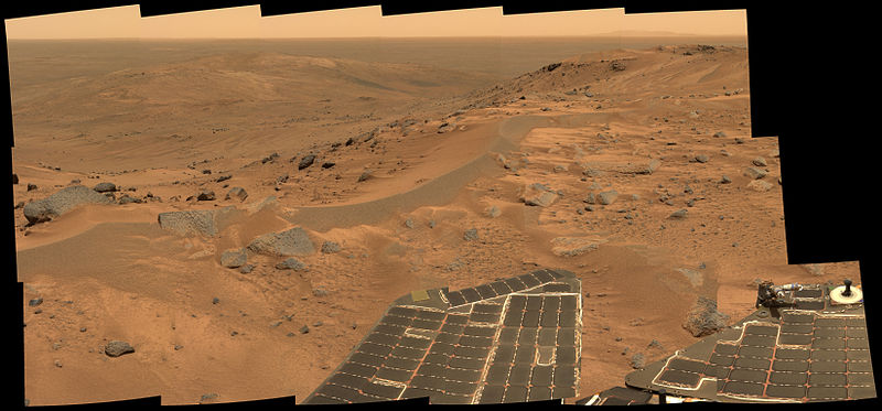
A view of Mars from the rover "Spirit"

A panoramic view of Mars taken by the rover "Spirit" from a hilltop several miles from its original landing site.

Many years ago, some scientists and engineers designed a robot to crawl around on Mars, taking pictures, gathering data, and performing experiments along the way. In most space projects, the design work is a big part of the cost, so to build two robots doesn’t cost much more than to build one, and they can back each other up in the event something goes wrong with one of them.

They launched the robots – named Spirit and Opportunity – in 2003. At that time, space machines on their way to Mars were haunted by a streak of bad luck where they had a tendency to disappear when they should have been landing. But these machines both landed on opposite sides of the planet as planned, overcame some early glitches, and went on to perform beyond expectations.

Each rover had its own team of scientists minding it back on Earth. With the rovers on opposite sides of Mars, one crew slept while the other crew worked. They were scheduled to work for the expected life span of the rovers, which was 90 Martian days… just over three months.

Last week, the space agency announced that Spirit has gone dark… six years after it first landed on Mars. Scientists have learned many amazing things about Mars that we didn’t know before. For the rest of us, we get to see Mars as a place that doesn’t look much different than some parts of Arizona.

We now have a better understanding of that world and our own world, but when we find answers we also find more questions. But we’re not finished yet… Opportunity is still running, roving around, taking pictures, digging up dirt, drilling into rocks, and doing all the other amazing stuff that was designed into it nearly a decade ago.

Many people say we shouldn’t spend money on exploring the solar system, that we have far more pressing needs at home. The total cost of designing, building, launching, tracking and controlling the two rovers is about a billion dollars. That’s less than one B-2 bomber, or one day of the Iraq war. I think our great scientific minds are put to better use building space robots instead of war machines.

The same factories that build military hardware also build machines for interplanetary exploration. The rocket scientists who design cruise missiles can also design Mars landers. And the technology that enables these missions benefits all of us… after all, the first digital cameras were designed for robotic spacecraft.

The life of Spirit says so much about the kinds of amazing and cool stuff we can do. We need fewer bombers and tanks, and more Spirit.

Intro to MacOSX for First-Time Users

In a partnership between Obbie’s Help Desk and Youtorial Market, I’ve just released a series of instructional videos on basic Mac usage called Introduction to MacOSX for First-Time Users. However, to call this product a “series of videos” doesn’t do justice to the teaching platform for which they’re built.

The Youtorial Player is an application that presents its content from a corner of the screen to walk you thru computer tasks. The content includes a video capture of the instructor’s screen accompanied by his/her voice describing and explaining the task. The content developer (i.e., I) can program the display of text and links in a box below the video, and I can make chapter breaks and “pause points”, where the presentation pauses to give the user time to try things out.

Given my extensive experience training users new to the Mac, the high praise I’ve received from those users and their supervisors, and the availability of purplearth’s production facilities and experience, I thought this was something I could do and do well, so last fall I submitted a demo video to the Youtorial people and was given a “Go.”

The course is targeted to two types of users I’ve regularly worked with over the years: those that come to the Mac from the Windows world, and those who are new to computers entirely (The prerequisite for the latter group is the ability to type and use a mouse). It starts at the Desktop of an account opened by a new user for the first time, and takes the user on a tour of the system and its workings, then goes on to guide the user thru personalization of his/her system.

Many parts of this course are based on lessons I’ve taught to users seemingly hundreds of times over the years. For twenty bucks, you get over two hours of lessons, which is a better hourly rate than you’ll find anywhere. There’s a 25% discount for the first month, so you can get it for fifteen dollars if you BUY NOW!  😉

In the future, I’ll be developing a follow-up course for Mac Administrators, and a course on basic Mac applications (iTunes, Safari, Mail, etc.).

I’ve seen what other publishers charge for tutorial videos, and I can confidently say that I’ve produced something that is a lot better and more useful than many products costing much more. So if you or someone you know is grappling with adjusting to the Mac way of doing things, send them here.

UPDATE (2013/03/21): All of the links to youtorial market no longer work… they went belly up without selling a single download. I still have the original videos, so I may do something with them at some point.

One Geek’s Dream Library

I’ve had a lot of exposure to different computer programming books, and I’ve learned to really like those published by O’Reilly Books. Their information is clear and concise without being loaded down with the useless fluff found in other publishers’ products. A majority of what I know about programming languages came from O’Reilly books.

As a matter of disclosure, I must admit that this glowing endorsement is not entirely unsolicited. O’Reilly just started a new “Win your wish list” promotion, where they ask book-starved geeks like me how we would spend $500 on their site. The rule is that to qualify, I have to post my wish list for the world to see.

So this post is my entry into the vast pool of geeks who’d each like $500 worth of computer books. I know that I become part of a viral promotion that will only cost them a few bucks, but I wouldn’t put out this effort if I didn’t genuinely feel their books are worthwhile.

My “wish list” is after the jump. In the likely event that my entry doesn’t get picked in the random drawing: If you have any of these books and you don’t need it any more, I’ll be glad to take it off your hands. 🙂 Read on

What They Tell Us vs. What We Want To Know

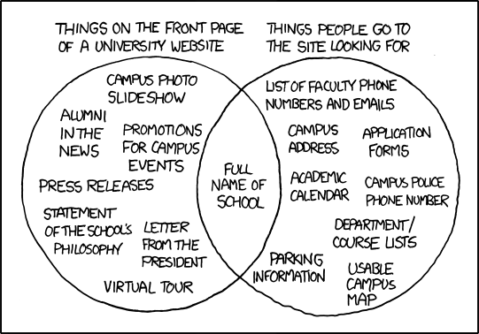
I’ve been reading up a lot lately on web usability, which is the art and science of making web sites user-friendly. Most of the literature deals with presentation (fonts, colors, layout, etc.) and programming elements (pop-up info boxes, dialog boxes, etc.). This diagram (hat tip to Jeffrey Zeldman) deals with actual content:

A venn diagram of what they tell us vs. what we need to know

Of course, this example illustrates a university website, but it could easily be adapted to the sites of  government agencies, non-profits, and even many businesses and corporations of all sizes.

When I showed this to RoZ, she had an immediate reaction to its humor and astute accuracy, even though I introduced it as “kinda geeky.” She made remarks about “publicity vs. useful information.”

It vividly illustrates a disconnect in modern communication where our major institutions have fallen completely out-of-touch with the people they serve.